How to play with light and colour
Give your home some room to breathe with light, bright colours
There are more than a few ways to help brighten your space by picking the right colour scheme.


The first thing to consider when brightening a space, is to use pale colours throughout. They reflect light and create the illusion of more space, while darker colours absorb the light, making the room appear duller and smaller. Choose colours like white, cream or yellow to make the room appear large, airy and tall. Follow the same colour scheme or patterns with your furniture and furnishings to create a seamless look.
When choosing colours for your walls, explore your options to see if they’ll work before decorating. It’s a common misconception that brilliant white rooms work in any light. White can actually make certain rooms look gloomy. If this is the case, look for warmer white tones like GoodHome Toronto or Ottawa walls and ceilings paint. And remember that gloss or metallic paint and wallpapers look much lighter than matt versions. Shiny finishes bounce light off them more easily than dull or flat ones, which (like dark colours) will absorb the light.
For whites and pale shades, we recommend our GoodHome walls and ceilings paint, available in shades of brilliant white or off-white shades like Alberta, Whistler, Quebec or Vancouver to help reflect more light into your room.


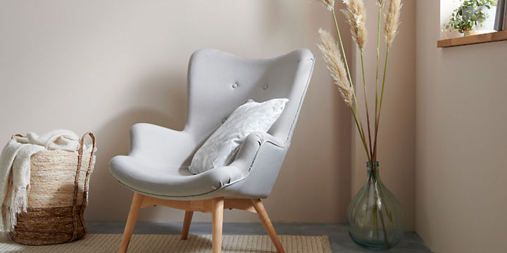
You don’t have to stick to light colours when decorating a dark room – adding a few bolder elements as accents, can actually make the room seem lighter by contrast. Accents are meant to be used as highlights, rather than on larger areas. If in doubt, stick to the 60-30-10 rule when choosing your colours.
In a dark room, light airy colours should make up 60% of your colour scheme. Your second colour is around 30% of your palette and adds warmth and interest, while the final 10% is the accent colour which can be darker and introduced as a feature wall in larger rooms or as accessories.


It’s not just the walls that may need a refresh – a fresh lick of paint on your ceilings can make a considerable difference to the space, making it feel tall and airy. Ceilings can discolour over time, especially if you smoke, have a fireplace or are a fan of burning candles and they can be easily overlooked when decorating. Do you have tall ceiling? If so painting them a darker colour can help open up the room.
Of course, you can always stick to a neutral or white if you just want to freshen your space. We love our GoodHome durable pure brilliant white walls and ceilings paint - bright, fresh and hardwearing too.
And once you’ve got started, refresh any wooden window or door frames, windowsills, skirting boards and coving. Paint them with a satin finish wood paint to accentuate the daylight coming in and reflect it into the rest of the room.
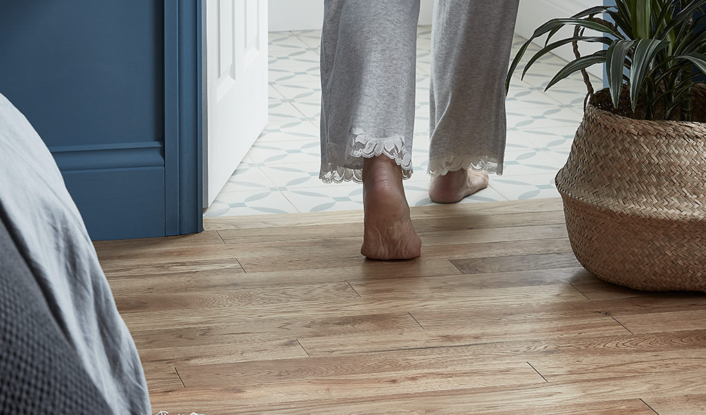
Like walls, lightening up your floors can make a massive difference to a dark space. For complete overhauls, consider our paler laminate, real wood and vinyl flooring options. We love whitewashed effect laminates for that distressed look. While for something more classic, we offer a range of lighter wood looks.
Don’t feel as though you have to rip it all up and start again – there are lots of ways to brighten what you already have. If you have hard flooring, like solid wood or tiles, simply paint them a paler shade with our specific project renovation paints. They can be used on pre-painted surfaces, won’t flake over time and are resistant to impacts and scuffs. Or lighten a dark floor by adding a light-coloured rug or door mat – this breaks up the colour and makes it more of an accent than a feature